Page 1 of 1
Advice on my stamp design
Posted: Fri May 02, 2014 7:02 am
by Jthompson1995
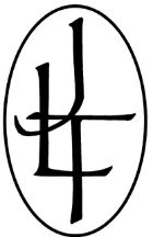
I am looking at getting a stamp made and would like to get some input on the design from someone who has more experience with this than I do. I did look at many of the threads about stamp sizes but there seems to be a bit of "it depends on the design" vibe when it comes to size and complexity as to whether the stamp would work well.
The design I came up with is a combination of my initials (JLT) similar to how I've been marking stuff I made for years, just more artistic I guess. I was thinking of getting the stamp so the height of the ellipse is right about 0.4 inches high which would make the width about 1/4 inch.
So, if anyone has a few moments, I'd like to hear what your thoughts on the design and size of this design for a stamp. Thanks in advance.
Re: Advice on my stamp design
Posted: Fri May 02, 2014 8:42 am
by mightysmurf8201
Sort of looks Oriental. Definitely unique, which is a good thing. Very identifiable. One of the biggest problems with coming up with a stamp or trademark in this business, is that most of the good stuff is taken, but is seems you've come up with something different than I've ever seen.
Re: Advice on my stamp design
Posted: Fri May 02, 2014 11:21 am
by oklahoma red
Are you wanting your initials to be recognized or the "pattern" of your initials?
There are six combinations of your initials: JLT, JTL, LTJ, LJT, TLJ and TJL.
In your design the three letters are overlapping each other so much one cannot be sure of their correct order. So, until such time as the pattern becomes a logo unto itself your initials cannot be recognized to identify you.
Smurf is correct, finding a good one that is unique is tough. Some sort of simple symbol is probably better than initials but of course I could be mistaken.
Chas.
Re: Advice on my stamp design
Posted: Fri May 02, 2014 11:48 am
by scotties22
The most important thing to keep in mind is "how hard is this thing going to be to stamp?". WHAT it is isn't nearly important as the ease of use. My stamp doesn't look anything like my logo. And unless you are Nate (I'm sure I'm forgetting someone else) most makers stamp doesn't match their logo anyway.
My stamp is my last name. So is Jesse's. Brian's is a G inside a circle. Simple is always better and easier to read.
Hope this helps.
Re: Advice on my stamp design
Posted: Fri May 02, 2014 12:04 pm
by BigCasino
I think technically, thirsty wouldn't stamp well due to the little space where all the letters intersect, but that's just my opinion man
Re: Advice on my stamp design
Posted: Fri May 02, 2014 2:27 pm
by N.Burnsworth
When I can afford to, I am changing my stamp as well. I started off just engraving B&B and the number of the pipe. I did that for the first ten pipes. I didn't want mine to get confused with other brands such as Briar Bird, BnB tobacconist, BBB , and a few others. Now I have a fancy lettered and curved Boulder & Briar
With USA underneath of it. It is to detailed of a stamp and with the curved lettering it makes it a pain in the ass to get a good impression. Less is better! And get separate stamps for additional nomenclature such as grading, number, year ect.
Re: Advice on my stamp design
Posted: Fri May 02, 2014 6:14 pm
by Jthompson1995
Thanks for the input everyone.
I had thought of using my last name, but seeing as it's "Thompson", it is quite common. A quick search for Thompson pipes yields at least 3 references to current or former pipe makers/companies with the same name.
I don't necessarily need my initials to be recognizable in the logo but want to keep some kind of continuity since I have been marking things with my initials since I was a kid. I thought this was a more artistic and easier since it will be a single stamp instead of the 3 I currently use.
I saw Abe Herbaugh stamp a pipe at the Midwest gathering and noticed his stamp is fairly detailed.
I likely will try to use this as a logo too if I ever get my act together and get a website and such.
I may try it to see how it goes, it's just money, right?
Re: Advice on my stamp design
Posted: Fri May 02, 2014 10:26 pm
by Joe Hinkle Pipes
After the feedback I've recently received from other pipemakers about my logo being too busy Im going to change it up to the key and maybe some shortened form of the name. No one has encouraged me to make a busier and more complex amazing looking stamp. If you like the way the initials look, go for it. I think it should be fairly easy to apply.
Re: Advice on my stamp design
Posted: Tue May 06, 2014 8:50 pm
by Vermont Freehand
FWIW, keep in mind things like the stroke width of letters and ovals. I have one with my last name (Norse) in cursive with a wider stroke width, and an oval ring. Stamping on a curved surface, sometimes the oval is so fine that it slightly shears the wood, showing a slight line of raw briar (being stamped on a stained pipe). I should have paid more attention to that when designing it, but if I'm careful, it's not a problem. I got my stamp from Sean at Buckeye Engraving and he helped me get the thing fine tuned. They were also half the cost of the competitors, it was something like $100 shipped.
Re: Advice on my stamp design
Posted: Wed May 07, 2014 3:40 am
by caskwith
I would advise against anything circular on design or especially surrounded by a circle. Eagle eyed members may have noticed I don't use my first stamp any more, it was circular and just weeks after ordering it I knew I had made a mistake and ordered a simpler design.
Re: Advice on my stamp design
Posted: Wed May 07, 2014 6:42 am
by Jthompson1995
Thanks for the insight everyone. I'm glad I waited a bit before ordering the stamp.
Since it seems like the oval may not be the best idea, would just the initials be ok, sans oval? Or should I start from scratch?
Re: Advice on my stamp design
Posted: Sun May 11, 2014 8:51 pm
by The Smoking Yeti
My stamp is circular- but it's very small, and easy to apply.
Re: Advice on my stamp design
Posted: Sun May 11, 2014 9:25 pm
by Joe Hinkle Pipes
The Smoking Yeti wrote:My stamp is circular- but it's very small, and easy to apply.
What would you say the diameter is? 5/16-3/8" im guessing. Im working on a stamp now and I would like to use a encircled logo. Its so much work just to get someone to answer an email.
Re: Advice on my stamp design
Posted: Mon May 12, 2014 12:05 am
by PremalChheda
Jthompson1995 wrote:Thanks for the insight everyone. I'm glad I waited a bit before ordering the stamp.
Since it seems like the oval may not be the best idea, would just the initials be ok, sans oval? Or should I start from scratch?
Jason,
I like your design as a logo. Better if you also have your name on it. If you decide on the logo, go as small as you can get it, and you should have no problem applying the stamp to a pipe.
